Back 2 Home
One design system to rule them all
Tokenized to bind three brands in Figma
Client
DAB company
Year
2024
Industry
Mar-tech, Cloud
Stacks

tEAMMATES

Amir Mohammadi
Sr Product Designer

Design Team
UIUX, Product

Development Team
Dev-Ops, Software engineers
MY FOCUS
Token architecture and naming
Multi-brand theming strategy
Variables/component setup
Hand-Off & Documentation.
SHARED WITH DESIGN TEAM
Component library build-out
UI audit across products
Design system contribution
& feedback loops
Problem
3 different products. Same development needs. Overlapping personas. Yet built in complete isolation.
A single multi-brand design system that all three products build on, aligning design and development, speeding up quality control, and freeing the design team to focus on velocity instead of repeating the same visual work three times.

THE SOLUTION
So we built one system.
A single multi-brand design system that all three products build on, aligning design and development, speeding up quality control, and freeing the design team to focus on velocity instead of repeating the same visual work three times.
WHAT'S INSIDE
One system, six foundations
shared across every brand.

Color system
Color tokens and palettes for themes and visual hierarchy.

Typography
A flexible type system with predefined roles and scales for readable interfaces.

Spacing and Radius
Spacing, sizing, and corner rules keep layouts balanced.

Icons
A huge icon set designed to stay clear, meaningful, and visually aligned.

Grid system
Responsive grids ensure consistent layouts across all screen sizes.

Shadows and Blurs
Depth and elevation styles that add clarity, focus, and visual rhythm.
Color Pallete
Built to scale, tested to be seen
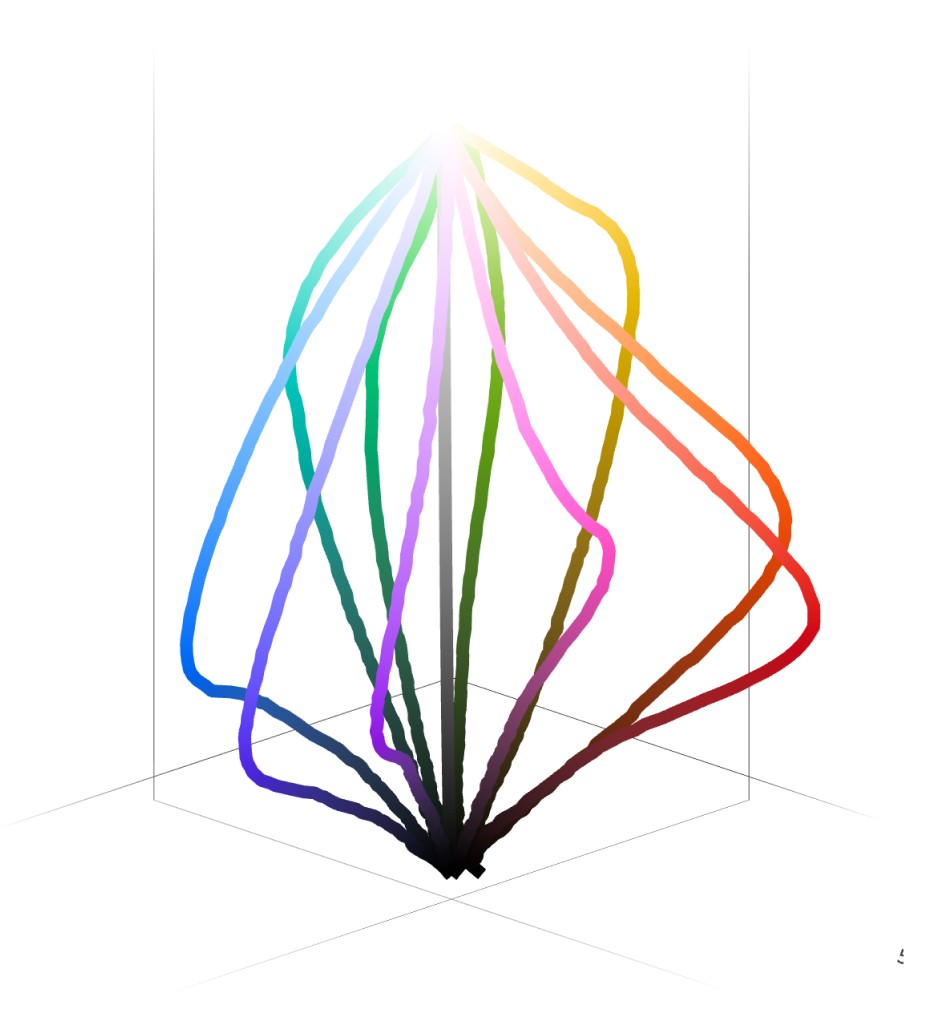
Every shade in this system is tokenized and checked against WCAG 3 (APCA) contrast standards, so color stays consistent, accessible, and ready for three brands at once.

I started with Tailwind v3. It wasn't enough.
Tailwind was a fast starting point, but colors felt flat and broke down in dark mode. So I built a color system from scratch with Adobe Leonardo.


Semantic Variables
Semantic variables define meaningful roles for colors instead of raw hex values, colors are assigned by purpose (primary, hover, active, disabled). This is what makes switching between Dark/Light Mode effortlessthe variable name stays the same, only the value underneath changes.

Typography that creates rhythm, hierarchy, and clarity.Built with semantic styles and variables.


Spacing Scale & Geometry
A mathematically consistent spacing scale ensures harmonious vertical and horizontal alignment across the interface.
0
PX
2
PX
4
PX
6
PX
8
PX
10
PX
12
PX
14
PX
16
PX
20
PX
24
PX
32
PX
40
PX
48
PX
64
PX
80
PX
96
PX
Spacing
By establishing consistent Spacing values for margins, paddings, and alignments, teams can achieve visual harmony and enhance the overall user experience.

Grid system
A grid that scales with the screen columns, gutters, and margins all tokenized, so alignment never has to be reinvented per breakpoint.

Icon set
I didn't reinvent the wheel here, I pulled icons from a few existing libraries and customized them to fit each brand's visual language, rather than drawing every icon from scratch.

+100 other icons
A library of UI components built on shared tokens. Each one has spacing, sizing, and state logic, for different brand/products
zoneit
philia
limoo
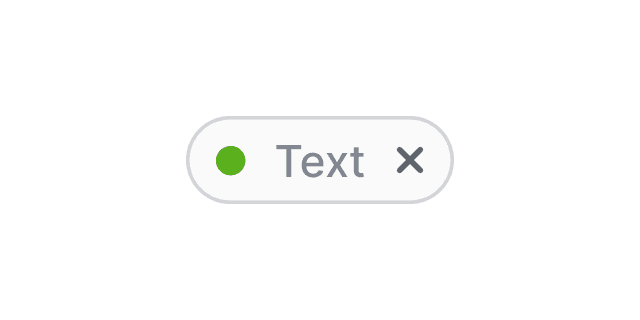
Chips
Compact elements used for tagging, filtering, or selection.

Selection Controlers
Simple selection controls with clear active and focus states.
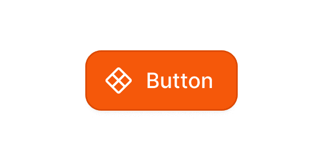
Button
Built with semantic colors and consistent states for clarity.

Avatars
Visual identifiers with support for user status and grouping.
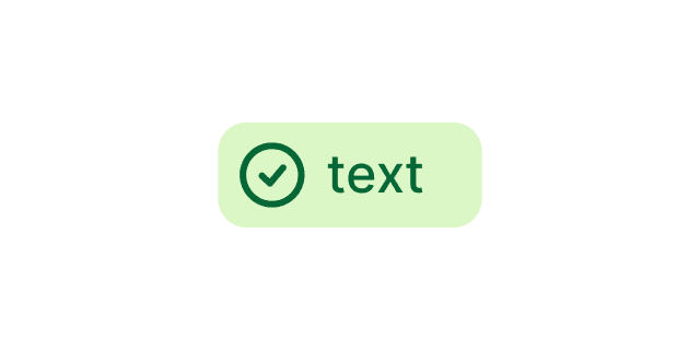
Badges
Highlights status or count using semantic color tokens.
Build components
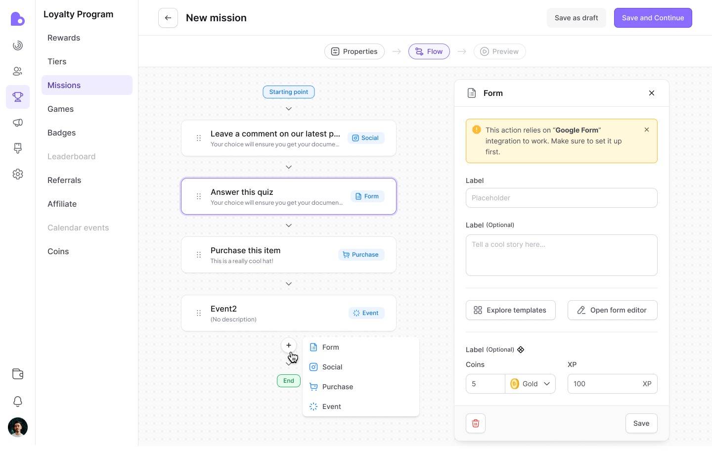
Components are built from nested instances and variables, one base component swapped through properties.

Documentation
I documented every essential decision, so no designer has to rely on personal judgment
From usage rules to states and spacing, every component ships with clear guidelines, keeping the product consistent even when multiple designers are working on it at once.


Resutls
Today, DS runs across all three products . Same tokens, same components, 3 distinct brand identities. What began as an attempt to stop duplicate work became the shared foundation the whole team now builds on.



Mostafa J
Sr Product Designer
We collaborated closely while building DS. Amir pays close attention to detail and looks at things from multiple angles ,design, business, development, always pushing for the most optimal decision rather than the easiest one.
What I learned
Don't Let Other Designers Guess.
every component needs a documented answer for "which one do I use, and when?"
otherwise two designers make two different calls, and the product stops feeling like one system.
Don't Make Developers Do Math 😉
round numbers win over "technically correct" onesو a breakpoint at 1280 instead of 1241, a button height that stays fixed instead of shifting by a few pixels per screen. Easy to remember beats pixel-perfect.
DS Doesn't Need to Be Perfect.
it just needs to be usable. our DS still has gaps Input's missing some states, a few components aren't built yet and that's fine. Shipping an imperfect but consistent system beats waiting for a perfect one that never ships.
A Design System Is a Living Thing
it keeps changing after "launch", new components, new edge cases, new brands even. The goal isn't to finish it once; it's to build it so it can keep growing without breaking what's already there.